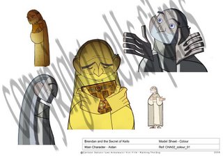
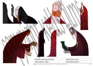
I was thinking a bit about the whole posting pictures thing - I like posting them, just to show whats happening to the few people I know who I don't see too often who drop by, and also because it seems to have gotten a few people in the industry to notice what we are doing and stuff.
Although this started out as a fairly personal Blog to just document what was happening, it soon became obvious that everyone had a sort of misgiving or whathaveyou about the types of things that should or should not be said and put up here, so its sort of evolved into a mixture of personal log and newletter of some sort.
I guess we'll put out an art-of book or comic or something of the development art and preproduction stuff, so while I'm not gonna give stuff away quite as freely or often as before, theres piles and piles more stuff being generated everyday and its nice to give a peek into the production sometimes.
Also to illustrate points and so on.
I've decided to try this - small sized jpgs , with BIG watermarks- hopefully that'll protect the stuff enough and allow us to still make some cash out of an "art-of"-book later ! (evil capitialist cackle MWAHHAHWHAW)
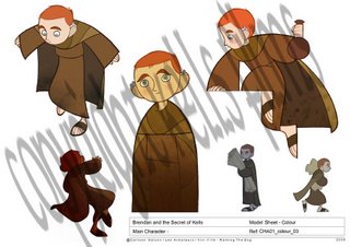
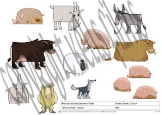
Anyway these are some cool colour models that were put together recently.
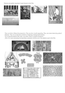
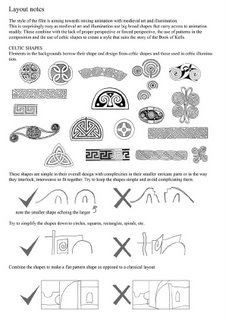
Also , a small sample of the layout notes Ross Stewart has been working on, which I think are little mini-masterpieces of information delivery in and of themselves. I sure hope they help everyone stay "in the style".


aww, those lines are so perfect, the curves, the colors the characters they form... wow!
ReplyDeleteBoy, Tomm, those animal designs are te-e-e-errific. Love them solid, simple shapes.
ReplyDeleteYES!!! More pictures at last! Beautiful work; your film continues to inspire. Would love to be able to grab an "Art of" book...
ReplyDeleteSign me up for a copy of that "Art of" book, I absolutely worship the art direction you guys are working in!
ReplyDeleteReally beautiful color and designs! An art of book would be excellent! I enjoy seeing your studios progress.
ReplyDeletewatermarks a little heavy handed, no ? i mean, its one thing to protect your work - please do. but its another to make it hard for people to look at it.
ReplyDeletethats a problem because i really lilke teh style of this movie very much and i come here a lot to look at how things progres...
maybe you could turn the opacity of the watermark down a little more ? fantastic art, keep it up, viva la two dee cartoons.
dany
... also, there is evidence that even with everything available on the net people will still buy a book to have and look at in their homes.
ReplyDeletedid i mention the art is beautiful ? thanks again.
I agree the watermarks are a bit heavy, but man, i can't stop looking at these gorgeous designs. I'll give you an address to ship that Art Of book ;) Can't wait for it!!!
ReplyDeleteThe design's are so simple and yet still very sophistocated ! Absolutely beautiful.
ReplyDeleteI saw the video on www.cartoonsaloon.ie and I've been so impressed! The project has an unique style with gorgeous character design. 2D is still alive!
ReplyDeleteWhat about an Art Book each month? I´ll buy it!! Great and great stuff. Love the simplicity of the lines and shapes.
ReplyDeleteIt's so good to see a studio that treats 2D animation as art instead of churning out flash junk. I don't begrudge you your capitalist ventures. You guys deserve every penny that you earn off this movie.
ReplyDelete