http://guriguriblog.wordpress.com/2009/09/21/insular-style-of-the-secret-of-kells/
NB - The folowing article is an impressive analysis of the visual styles and themes in the movie.
The only correction I would say is that the writer misunderstood the name of the crystal magnifying glass in the movie. "The Eye of Crom" refers of course to the worm god Crom Cruach who Brendan battles in the movie.
Still, its impressive and flattering that someone would take the time to write about our film in such depth.
Insular Style of The Secret of Kells
September 21, 2009
It has been some time since I sat through an animation as gorgeous as The Secret of Kells. Although highly experimental in style, the film is still accessible enough for wide range of audience to enjoy so I encourage you to take a look at this extravagant piece of art. What intrigued me the most about the film was its fascinating designs and animation inspired by the Insular Art (artistic style) of The Book of Kells, which will be the focus of this article.
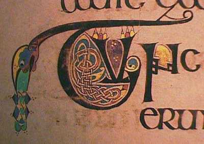
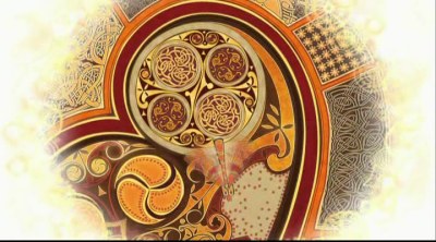
So what exactly is The Book of Kells? The history or purpose of this illuminated manuscript is not relevant to the interest of this article. What is relevant is its elegant designs and its relations to the film’s visual style. There are three main points I want to make in this post, and the first is its chaotic ‘loop’ of interlacing curves that you can see in the above picture.
‘Chaotic loop of interlacing curves’ is a pretty succinct way of describing the knots, braids and weaving found in the book. Why chaotic? Because chaos refers not to things that are random, it refers to things that are difficult to comprehend. The technique of interlacing in the book follows a number of simple rules but the actual illustrations appear chaotic because of its sheer degree of complexity. We can not fully comprehend the logic of its pattern at glance but we can instantly sense its beauty.What’s interesting about one of these ‘rules’ is how the strands of the crossings must be endless, and that no more than two strands can cross at one point. So if you focus and follow the strand (try doing it above with the picture on right), you will be stuck in an endless loop of one long strand interlacing itself.
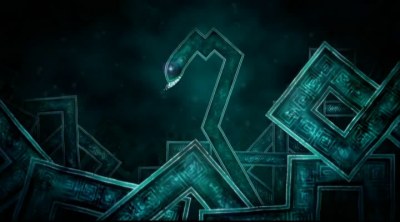
The reason why the animation of The Secret of Kells is so fascinating is because it feels much like following that interlacing strand. The way characters move, and even how each frame is composed creates that ever flowing sense of movement. You just have to see it. Ben has put it extremely well here so I’m just going to quote him:
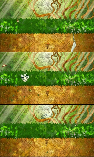
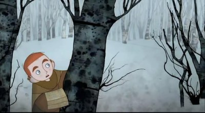
The choreography of the movement of the characters through these compositions is quite ingenious. It’s like they’re constantly shifting perspectives on you, coming up with creative new ways for the characters to move through the environs. In that sense it kind of reminded me of The Thief and the Cobbler. Representative of this is a shot in which a character is climbing a tree. The leaves form a sort of line that divides the screen into two. The character climbs up across the left half, then passes under the line, and in the right half the perspective is suddenly different, as if they were two distinct shots. It’s unexpected and subtly done and has a marvelous effect, like a constantly shifting and shimmering optical illusion. So much thought was put into coming up with a variety of ideas to make each shot interesting like this. It’s not just the animation and art that are stylized – the directing is too.
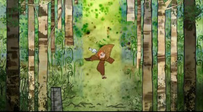
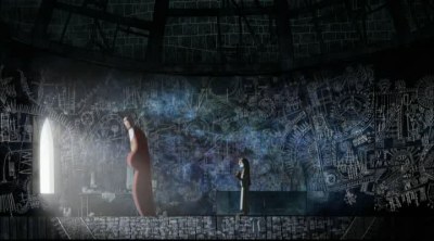
Another thing I want to add is that even the way the consecutive frames are strung together achieves similar effect. Whether it’s climbing a tree, running through a forest, or traversing the walls of the tower, one could almost imagine the camera making elegant curves as it swoops us over these landscapes. It’s like the creative staffs managed to translate the language of Insular interlacing in animation. Brilliant.
Another point of interest in the book’s design is the sheer level of details. In fact some details are so meticulous, it can only be fully appreciated with a 10x magnifying glass. There is no magnifying glass in the film but there is a magical artefact called ‘The Eye of Cromwell’, a reference to the fact that the real Book of Kells was lost during the period of Oliver Cromwell.
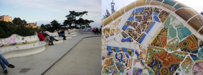
There’s an interesting relationship between this detailing feature of the book and the way The Secret of Kells presents its landscape. Animation is beyond a 2D plane, it’s an illusion to a 3D world. Our human eyes have a limited visual perception and acuity thresholds, therefore our ability to appreciate the level of colour variations and geometric differences changes as our spatial relationship with that object also changes. This is why architects have to consider, for example, how a surface may look from both end of the spectrum. See below, how Gaudi’s surfaces are so intricate at microscopic level and yet blend in so sublimely with the bench at greater distance.
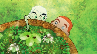
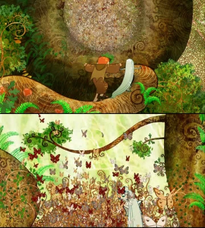
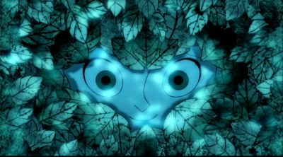
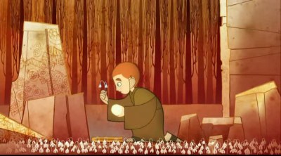
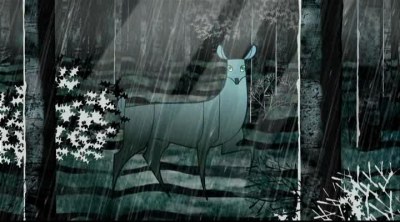
There is a particular scene in Secret of Kells that does this beautifully as well, which you can see in the below picture. At one moment we see the characters approach a giant ‘ball’ of different coloured spots. At closer inspection we find that the dots are actually butterflies fluttering about and filling that large air gap. It’s also interesting that one of its messages is ‘you learn more from the forest then inside the wall’. From far away, imprisoned by your closed minds, it’s impossible to appreciate great things. You need to open that wall, open your mind, and traverse the nature to find god, to find the truth. To paraphrase Deleuze, philosophy can only be found at the front of non-philosophy.
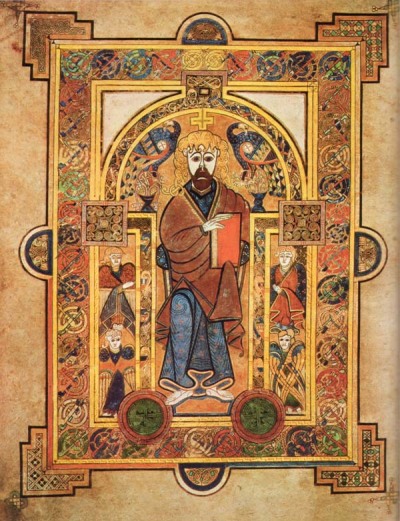
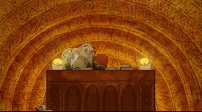
The Book of Kells is also known for mixing figurative with the ornamental (i.e. iconic pictures of people in decorative background), which continued to be the characteristics of later medieval illumination art. One of the reasons why each screens are so inviting to viewers may be that, despite highly experimental and sophisticated textures of backgrounds, they work well in harmony with more simplistic character designs. There are several other anime titles that I think are exceptional in this field too, including Kemono no Souja Erin.
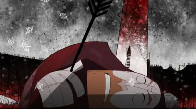
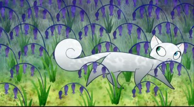
Although nothing impressive story-wise, this is definitely one of the most visually innovative animation you will likely to see. There is another point I want to mention briefly and that is its harmony between the visuals and soundtrack. It’s simply a feast for eyes and ears. It’s the kind of melancholic and beautiful harmony one would find in Kaiba and Casshern Sins (I remember talking about this type of aesthetics briefly with bateszi on MAL). I’m sure the below clip will win anyone over (also look at how the cat moves in that ‘interlacing’ movement, and how camera movement swoops the tower in similar fashion).



September 21, 2009 at 2:17 pm
Well that certainly was lush. Each screen cap is overwhelming. I think I’ve been trying to write this comment for an hour now.
Your Deleuze quote is delicious. lelangir said it differently, but he and I (and Deleuze apparently) agree that one needn’t look to a ‘deep’ subject the create a deep experience. I can easily have such an experience watching K-ON! as much as anything else.
In the case of this work, could it be that the thematic expression — the real work in it, is intended to reside less in the narrative, but more in the images and their motion? It seems like an obvious point, but I hope you know what I mean.
September 22, 2009 at 5:46 am
Fascinating stuff. I have an amateur interest in illuminated manuscripts, especially the works preserved by Irish monks, so this is definitely something I’ll have to check out.
For a cross-cultural look, have you seen anything done for the Qu’ran? Islam prohibits images of the prophets, so what artists did instead was turn Arabic itself into a work of art– a twisting, complex, utterly beautiful work of art. I recommend looking into it.
September 22, 2009 at 1:49 pm
@ghostlightning
I think Deleuze’s exact quote is “philosophy needs a non-philosophy that comprehends it”, in this case the characters of the film finds philosophy by interacting with the nature, and not confined to the walls of the abbey. I guess it’s possible to find deep things in just about anything, including K-on!, although different people will get out different things (i.e. I didn’t think much of K-on…)
Yea, it’s much more expressive visually than narrative, although to be honest the story was bit too much lacking imo. Kind of like Ponyo, but in this case it is bit harder to forgive for me. It’s a shame really because it is visually just so strong.
@2DT
Haha, I’m really surprised that you seem to know a little about everything I touch on, from Deleuze/nietzsche, Tasha. I am aware of the history of Qu’ran but not terribly familiar with the actual images and texts in it.
And yes, I highly recommend checking this film out, especially if you have intersted in illuminated manuscripts =D
September 22, 2009 at 6:45 pm
Just finished this (oh joys of the internet age, that such thing can be readily found) and am very pleased. Personally I was quite happy with the simplistic story structure – although it felt a bit too hard on WallMan at times. I did like Aisling’s retreat from Brendan a great deal – one of those unexplained but utterly right developments.
Anyway, enjoyed your points about intricacy a lot too, and the succession of images from the oak tree scene.
I was thinking that a lot of the moods/places in the film involved heavily dominant colourschemes which, to me at least, mean a very different way of experiencing intricacy from how I imagine staring into depths of colour in the book. Most frames had one scheme going on, and one doesn’t always have time to stare deeply into it to discover the layers, but the animation leads into the next scene in a manner which makes it feel like an exploration of the same scheme. Well, I’m getting a bit incoherent, but this was gorgeous and a very fine recommendation.
September 23, 2009 at 10:12 am
Yay my recommendation worked!
And yea, I love their colour schemes too. Each frame is so well considered, I wish more studios would put more efforts too.
September 24, 2009 at 6:36 pm
I wanted to check this out but the book is $40 on amazon, a bit pricey for my walletbook. Maybe my patience will pay off!
September 24, 2009 at 7:01 pm
I’ve been lurking from time to time as I found out we share some anime titles favs-wise , plus you always write thoughtful commentaries.
I knew nothing of this little jewel of animation, for a medieval fine arts students like me this look like a treat indeed. I’m spamming your post to some pf my friends too XD.
Thank you for blogging!
September 25, 2009 at 7:46 pm
@Cello
I hope you meant blu-ray disc, because $40 is quite a BARGAIN for the price I’d pay for the real book!
@elianthos
Yay another lurker de-lurking himself ^_^
Thanks for the kind words and I’m glad my posts have been somewhat amusing. Feel free to de-lurk time to time and fill up my lonely comment box =)
September 25, 2009 at 9:33 pm
You’re welcome XD, I bow to your taste and your maind. ). Perfect timing, as I watched 1001 nights yesterday (oh, my, the Gustave Moreau-esque + sprinkling of Disney Fantasia’s sabbath sequence visuals . And a bit of Kanashimi no Belladonna too, especially in the ’simple sketches moving and morphing’ moments)
Forgive my typos and possibly unclear wording btw, I’m good at drawing but bad at typing. Moreover, English is my secondary language only.
I’ve spotted Fantascope Tylostoma among your recent viewings (review coming about this title too, yes?
What a treat.Possibly Even more engaging as I was watching it well after midnight , (a bit of altered… self-awareness(?) helped the mind-trip I guess? I felt like I was being sucked in and dreaming along with the characters, so vividly ^_^;; )
Back to The Secret of Kells. Is indeed visually pleasing and different, chara design – aptily retro – matches backgrounds and Celtic patterns well , plus I love the OST. . She’s looking forward to -ahem- sampling it).
I can only hope Buena Vista International is planning for distribution here in Italy (been spamming this movie to my Medieval Archaeology college professor and plan to notify her colleagues too
—
Thanks again for blogging and sharing your thoughts with us.
P.S.: I’m a ’she’ XD
September 25, 2009 at 9:42 pm
EDIT: digressing some more on Yoshitaka Amano, I’m being irresistibly drawn to this right now http://anidb.net/perl-bin/animedb.pl?show=anime&aid=6203
. I hope someone will sub it ^^
Does Fantascope Tylostoma feature some dialogue or nothing at all? Just to know if I can watch it raw ^^
September 26, 2009 at 1:28 pm
Altered state is the best state to be in when watching artsy stuff like Fantascope =D. Your body needs to be relaxed, to feel those colours, movements and lines with your body, and just tired enough for your mind to not think too much, untie our way of thinking, and just connect to the imagination.
As for Fantascope, it has lot of dialogues, but I watched it raw anyway. Of course I didn’t understand the details but I think it’s better to watch it raw than not watch it at all!
And I hope your professor and colleagues enjoy the film too. And thank you again for the kind words, really makes my efforts worthwhile!