


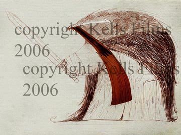


Last year Jean Baptiste did some really great concepts for the Vikings - a few of which I post here.
The roughness of their line in contrast to the stained glass type line on the main characters is something we really wanted to keep.
For a while we even thought of doing them CG.
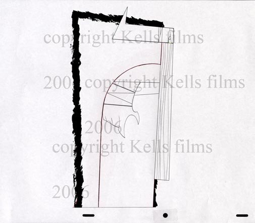
Anyway we decided to do tehm 2d but we are trying to find a way to have a cool rough outline on them. One test we are doing with the Frere Ume in Liege in belgium at the moment is this test of a drybrush type outline.
The idea is to have the computer track the red line on the clean up (by Martin Fagin) with the drybrush ink-line.
It might be a bit of stretch. But failing that we can always go for that "rough animation" pencil outline look. I'll post how the tests go...
Awesome viking, very imposing.
ReplyDeleteWOW! Amazing concepts. Sure hope you can pull off the rough linework... it's a great idea! Everything's looking incredible, as usual.
ReplyDeleteSuper Scary vikings! u shud come here and meet some real life ones! let me know if u still need help with some swedish! All the best, Charlotte Åberg
ReplyDelete