hey thanks to all who stopped by!
was down in the new place today - skunk fu moved already.
its lookin nice. should be cool maybe a bit packed but the "newness" will be nice.
so, turns out we are lacking a layout artist, so anyone reading this who is interested please do
get in touch - we need an experienced person who is willing to live in KK, actually experience is only kinda nessesary being good at drawing and able to use photoshop is moreso.
anyway heres something a little crazy -
http://mrl.nyu.edu/~jhan/ftirtouch/index.html
the future eh? I found it on www.drawingboard.org, in the tech section was thinking of getting a cintiq or a tablet pc but was checking what people thought about it when i stumbled on this. we were all oohing and aahing at it today.
we have this running joke in the studio about the ANIMATRON 2000 a computer that animates for you - you just say "more appealing, jump! - higher! now do it with emotion!" and so on.
this seems like a step in the right direction.
heh
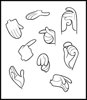
anyway heres something more old school - some of Martins clean up on Brendan - (which i guess is gonna appear at the top of this message) - anyway it was gas to look at this "future" yokey and then go and order old school stuff from chromacolour for the clean-up - pencil, gloves even cels!


woah, that multi touch screen is fantastic! cant wait to get my hands on one of those babys!!
ReplyDelete:)
Hey all the work in this blog looks amazing! I think the animation will turn out incredible when you guys finish, great work!
ReplyDeletewww.carlosillustration.blogspot.com
absolutely enjoyed your blog :)
ReplyDeletewill be back for more!
kind regards from an animator in Amsterdam :)
Hello. I just found your blog. All the work on here is awesome. Very inspiring. Thanks for showing it!
ReplyDeleteThe work here is great. I absolutely LOVE those hand designs.
ReplyDeletewow, i love the design you guys have on the film. its amazing! i'm putting you guys on my links.
ReplyDeletemsalmon.blogspot.com
wow, i love the design you guys have on the film. its amazing! just gorgeous.i'm putting you guys on my links.
ReplyDeletemsalmon.blogspot.com
Great great great.
ReplyDeleteI am very much looking forward to seeing your project brought to life. Is there any chance of posting the 6 SotK images from the Cartoon Saloon site over here on the blog? They look amazing but are too small to do them justice.
Also, are you familiar with Ben Caldwell, the art (and clipart) of Steve Erspamer, and the game Zelda: the WindWaker? This style is one of my favorites and it finally seems to be blooming into broader appreciation.
Keep up the great work, it's beautiful and I appreciate you sharing it with us before it's finished.
Too beautiful a site to be missed...I'm gonna watch u like a hawk from now onwards! ^^ Lovely,Tomm,just lovely!
ReplyDeleteAh,looking good there Tomm. It's been a long road making this film
ReplyDeletebut it looks deadly. I'll spread
the word.
Hey Tomm, Glad you guys have a blog going. You probably don't remember me but I sent you guys a portfolio a couple years ago. I'm still in LOVE with this project and I'm so excited that I get to watch the progress on your blog. I like the evolution the style has made since I saw your demo stuff on that dvd a couple years ago. I'm still super excited to see the finished stuff when it's done and makes it's way to California again. Best wishes and I hope you don't mind if I link ya guys.
ReplyDeleteMary J. Hoffman a.k.a the Boogervampire